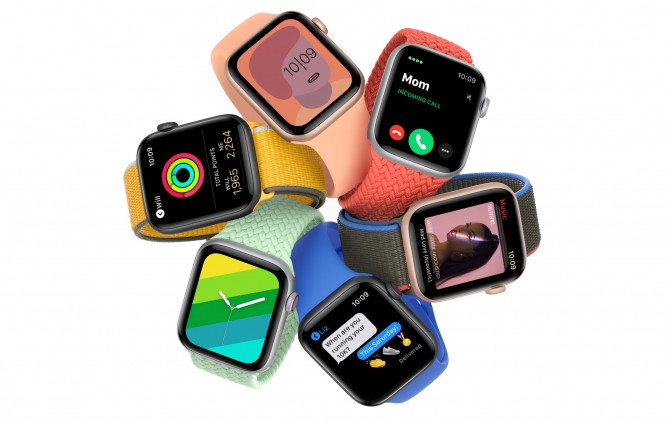
Apple Watch Series 6 is the latest generation of Apple’s smallest computing device. It promises brighter always-on screen, new blood oxygen monitoring, U1 chip and Ultra Wideband antennas. For people upgrading from older models, Series 6 will bring a larger screen (44mm), digital crown with haptic feedback, built-in ECG sensor, optical heart rate sensor, compass and fall detection feature. All by promising the same almost-a-day battery life.
I upgraded from Series 3 back in January 2021. Planned to get Series 5 last year but COVID happened and I saw little justification of smartwatch upgrade during lockdown months. My main drive for upgrading was to get an always-on screen. Call me old fashioned, but after years of wearing my Series 3, I still can’t accept that I need to move my wrist to see my watch showing time. I consider it lucky that Series 6 offers a brighter always-on screen claiming to be 2.5 times brighter when outdoors. Slightly bigger screen is also a major factor, considering that I am upgrading from Series 3 with a 42mm screen. The extra 2mm is apparently big enough to allow more watch faces with more” complications”. All the other features (heart rate sensor, ECG, etc) are just nice bonuses to me.

First impression, my new Apple Watch Series 6 looks… well… quite similar to my old Series 3. The real differences can be observed at the back sensors, and also when the screen is turned on because the display size is bigger.
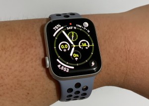
Setting up process is quite straightforward. I unpaired the old Series 3 from my Watch app, and the backup restores to the new Series 6 when I paired it the first time. Right after setting up, I was excited with a number of watch faces I did not have before with Series 3. Thanks to the 2mm extra, the new Infograph face lets me to show everything I need on one screen. Some Nice-specific faces are nice bonuses because I choose Nike model this time.
Series 6 is noticeably faster, which is to be expected, considering I upgraded from technology from 3 years ago. All interactions with the watch feels smooth and snappy. The always-on display looks nice. It doesn’t show all the personal information and some animations are turned off, but it serves the purpose well to always show a watch on the screen. In my case, showing time and weather forecast (temperature, UV index and chance of rain). I could see the always-on screen just fine both indoor and outdoor.
It takes a bit of time to experiment with different watch faces and complication settings. Some older apps could not show complications in newer face and vice versa. Since we can have multiple watch faces set up and can quickly swipe between them, some people prefer to have one face for certain scenario. In my case, I have my main face for most situations, one face for everything related to health and activities, one face with quick shortcuts to my most frequently used apps.
ECG feature works well. The digital crown functions as a sensor and it is kinda cool to see our own heart pulse appearing as a chart. Blood oxygen feature works, but it is a pain to find the right arm position that would allow proper reading. I’m surprised that this kind of user experience passed Apple’s UX design. I expect better from Apple.
I did not try the fall detection feature. Well, I hope I would never need the feature, but it is nice to know that it is there.
Battery life is decent, even with always-on display. I charge my watch every morning, about an hour, use it the whole day, wear it to bed for the sleep tracking feature. When I wake up in the morning, I usually have somewhere around 10% to 30% battery left. In 2 months of use so far, only once I woke up with empty watch battery.
A good upgrade so far. Is it a mind-blowing innovation? No. But it is a nice iterative improvement from an already-solid product. If you have Series 4 or Series 5, upgrade to Series 6 is obviously optional. But if you have Series 3 or older, the improved experience is arguably worth the upgrade.

Leave A Comment